I am presently infatuated with the typeface Futura. It conjures up a lot of memories for me… for example, I’m pretty sure that every school I’ve ever attended used this typeface on the building. Every Wes Anderson movie too. And of course, some favoritedesigners.

It’s a popular font, and because it is simple and has been around a long time, there are countless variations produced by a large number of type foundries. This inspires a lot of discussion about the best version to use. Spoiler alert: there probably is a best and most authentic version out there, but it’s going to cost you quite a bit for the whole family.
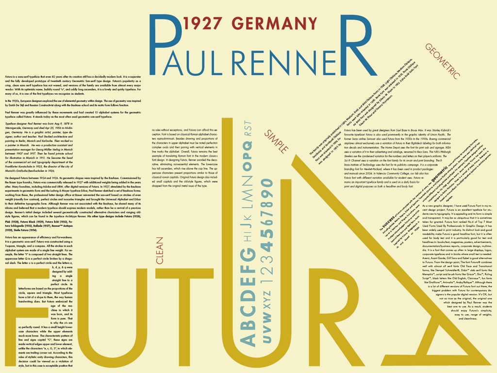
Futura was designed by Paul Renner in 1927, and if I do a “get info” on the typeface in FontBook on my Mac, I even get a bio.
Paul Renner (1878-1956) was a painter, typographer, typeface designer and teacher. Between 1908 and 1917 he designed thousands of books for Munich publishers in a refined traditional style. In the early 1920s he began to support the modern styles of architecture and typography, becoming a leading proponent of the New Typography. Renner is best known for designing the typeface Futura, which became a standard tool for the New Typography, and remains a popular typeface today. Futura does give a restful, almost bland impression, which accords with Renner’s objectives. Futura seems classical, not only due to the form of its capitals, but also to the open, wide forms of the geometrical small letters. The typeface relies on notions of classical, yet contemporary form, – harmony and evenness of texture. Thanks to the modern digital technology Futura lives on in a greater variety than ever, offering a wide choice of typographic solutions for contemporary design in the new millennium.

One drawback to the Futura included with the Mac is its limited weights. For example,the delightful bold weight is not included. Combine that with the fact that it’s not common at all on PCs, and you have to come to the conclusion that it’s not ready to be used on the web. Which is kind of a shame, because it’s such a useful, attractive, and common typeface. It would be handy.
Therefore I was very excited yesterday to hear that Adobe has licensed some of their typefaces to be used in Typekit. I figured that their (far from perfect, but pretty good) Futura was bound to be included, but alas, it was not to be so. No foundry on Typekit offers Futura yet, so we’re still stuck using Gill Sans for now.
Interesting tidbit about Futura: it originally included a “Black” weight that bore little resemblance to the rest of the type weights, but definitely reminds one of the time and place in which it was designed – Germany, in the late 1920’s, during the Bauhaus movement.

Another interesting tidbit: Futura is on the moon!