Materia Prima
A Botanical-Inspired Brand for a Farm-to-Farm Micro Roastery
Introducing a new coffee brand requires more than clever design. It demands authentic storytelling rooted in place and purpose. When Luca and Rachel approached us to develop a coffee brand that would bridge their Italian heritage with their Georgian homestead, we embraced the challenge of creating an identity as rich and layered as the coffee itself.
Services
Client
Materia Prima
A Name Born from Essence
The name Materia Prima—Italian for “raw materials”—emerged as our guiding star, a linguistic touchstone that honors both origin and process. It speaks to coffee’s transformative journey from seed to cup while celebrating the fundamental elements that make exceptional coffee possible: soil, water, air, and devoted human hands. It’s a name that sounds as good as it reads, and it captures both sides of the brand naturally.
We are very pleased with the name and identity. It communicates what is truly important in coffee, our lives, and in food.

The Visual Harvest: Designing Nature's Narrative
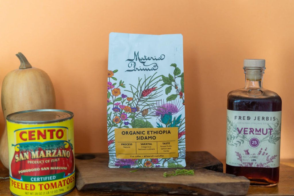
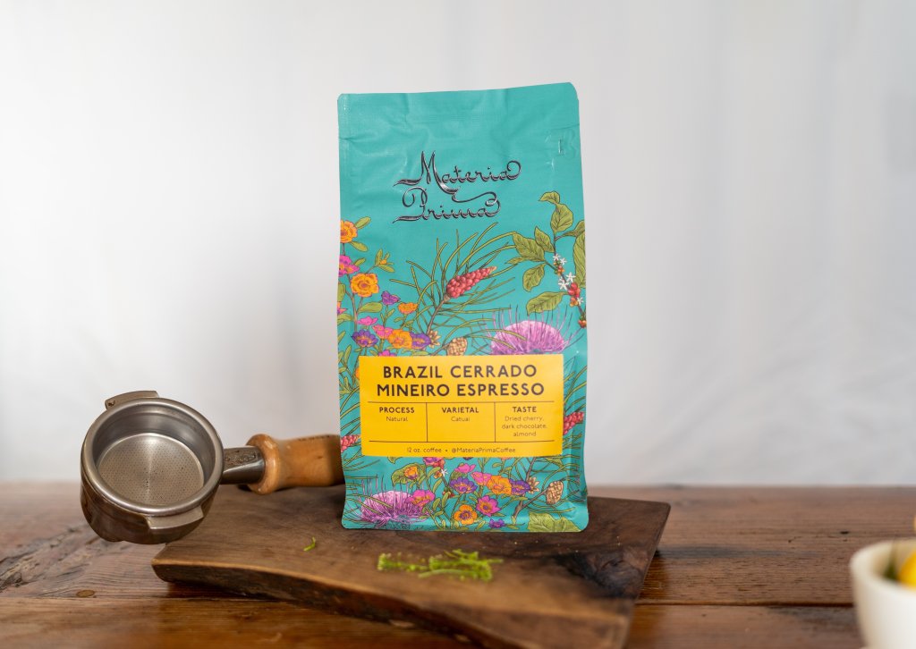
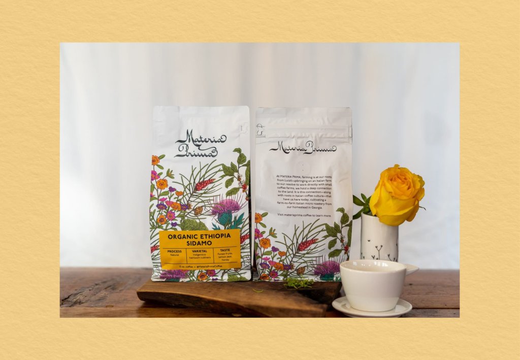
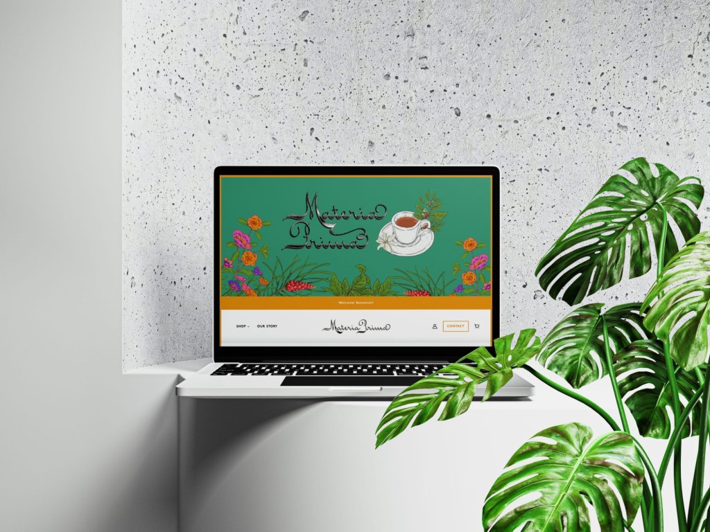
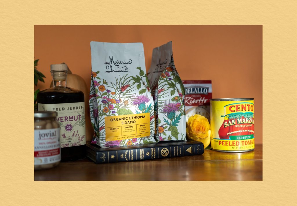
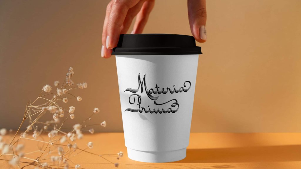
Every visual element connects the brand's two worlds. The flowing typography has an Italian elegance to it, and the botanical patterns feel rooted in the land where the coffee actually grows. Together they create a design system that feels alive and intentional.
The name itself does a lot of work here. It's an absolute delight to say, and the logotype gives it a visual warmth that pulls you in before you’ve even opened the bag.
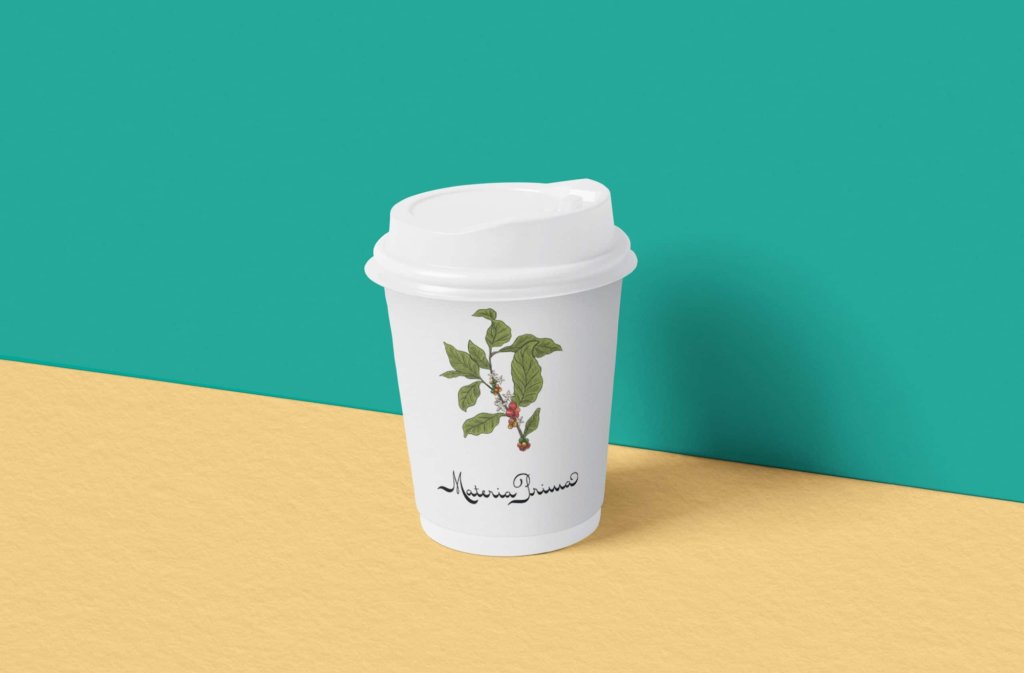
The logotype is organic and flowing, with letterforms that connect like branches of a carefully tended plant. It feels Italian in its elegance but grounded in something warmer and more personal, which is exactly the balance Luca and Rachel were after.
The color palette comes straight from the source material: earthy umbras, deep greens, and the bright crimson of coffee cherries. It feels like a garden and a farm and a cup of coffee all at once.
Botanical Alchemy: The Artisan's Hand
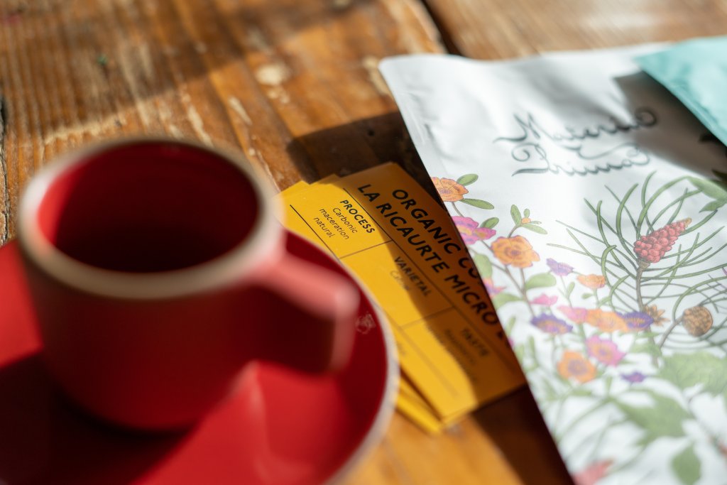
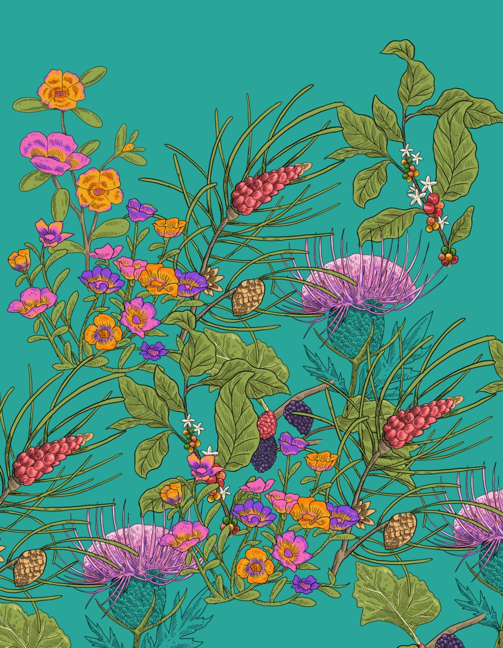
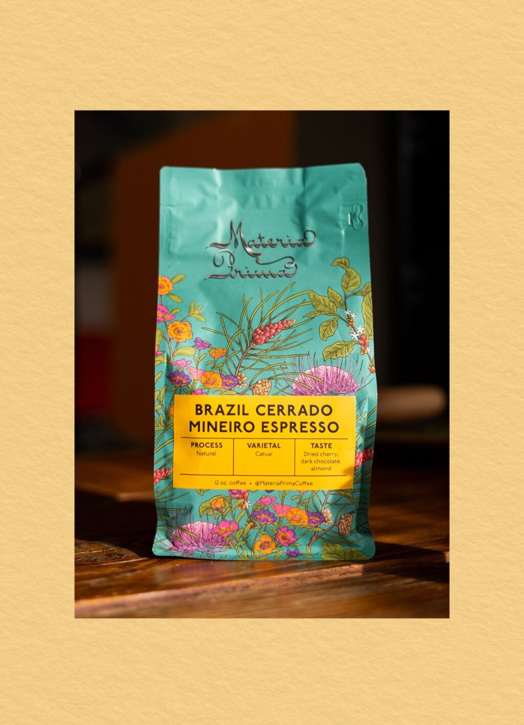
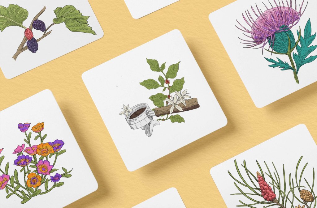
The hand-drawn botanical illustrations are the heart of the brand. They honor both the coffee-growing regions and the farming traditions that Luca and Rachel carry with them from Italy to Georgia. There's a shared reverence for the land in both places, and the illustrations make that connection feel natural rather than forced.
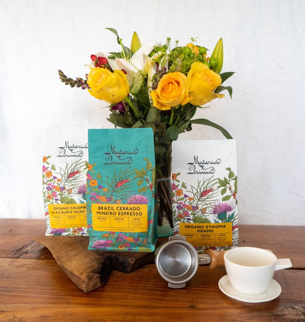
The illustrations turn every bag into a small piece of storytelling. You don't need to read a word to get what this brand is about.
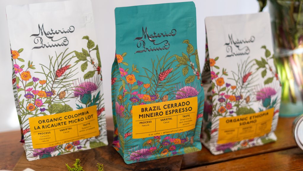
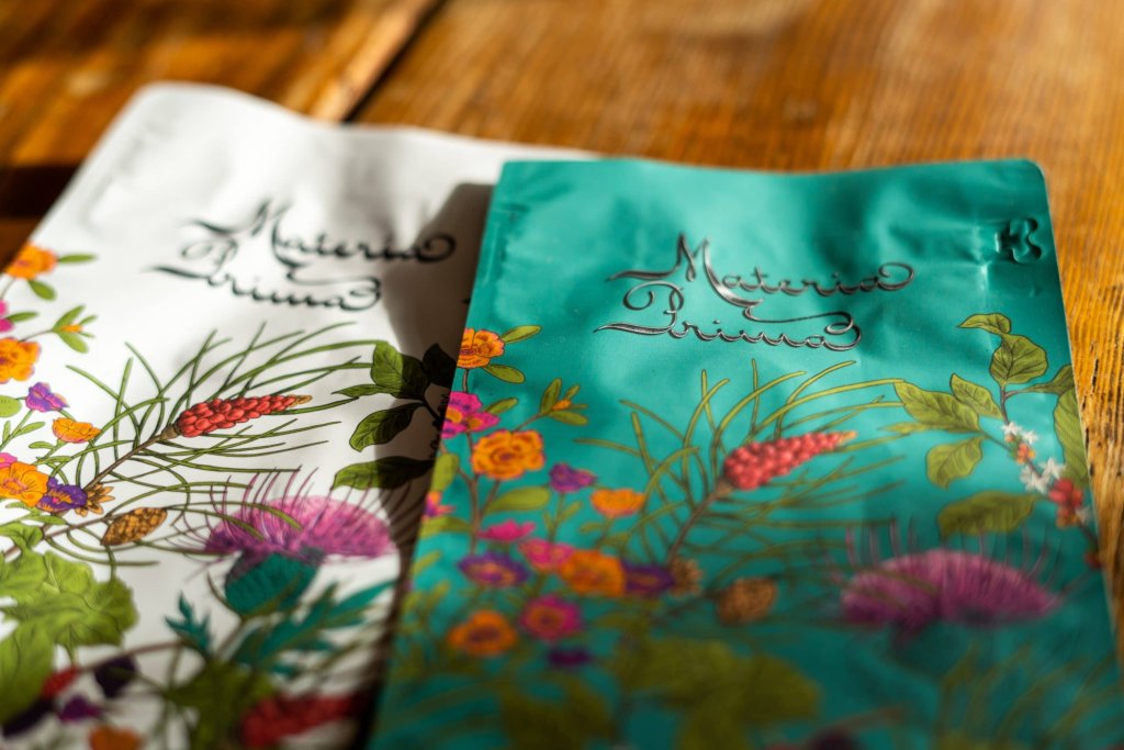
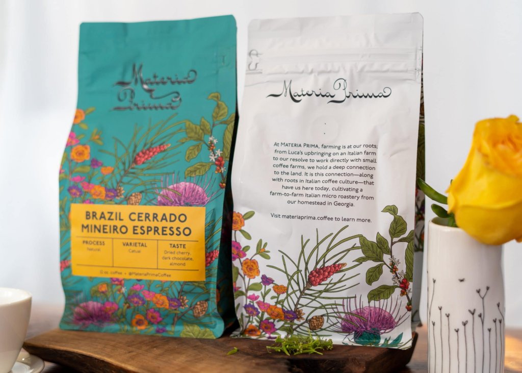
Our packaging is beautifully illustrated and designed. It illustrates our love of the land. It is colorful and vibrant, sophisticated but approachable.

