a bbq set-up Image loaded

Pozo Barbecue

Creating the ingredients for a mouthwatering brand

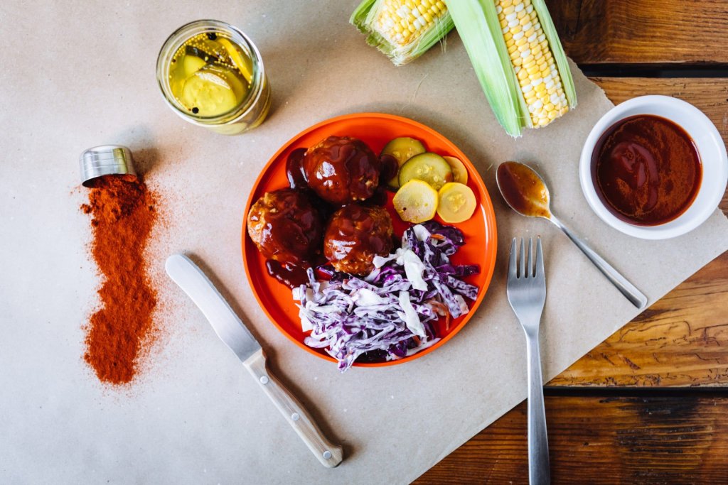
In the heart of Qatar, where tra­di­tion meets inno­va­tion, Pozo emerges as a sen­so­ry sym­pho­ny that tran­scends the con­ven­tion­al bound­aries of bar­be­cue. More than a restau­rant, it stands as a cul­tur­al bridge — a warm, invit­ing haven where expats and locals alike gath­er around the pri­mal ele­ment of fire to share sto­ries, expe­ri­ences, and excep­tion­al cuisine.

Naming Alchemy: The Birth of Pozo

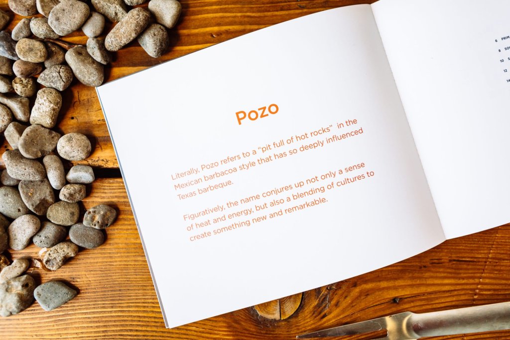
The cre­ation of Pozo’s iden­ti­ty began with the search for a name that could car­ry the weight of mul­ti­ple cul­tur­al tra­di­tions while remain­ing dis­tinct­ly mem­o­rable. Like a mas­ter chef select­ing the per­fect spice, Need­more dis­tilled the essence of bar­be­cue’s her­itage into a sin­gle, pow­er­ful word.

Pozo” — lit­er­al­ly mean­ing pit full of hot rocks” in the Mex­i­can bar­ba­coa tra­di­tion — evokes the ancient cook­ing method that pro­found­ly influ­enced Texas bar­be­cue. But the bril­liance of this nam­ing lies in its dual nature: it simul­ta­ne­ous­ly con­jures the tan­gi­ble heat of smok­ing embers and the intan­gi­ble ener­gy of cul­tur­al fusion. The name becomes a ves­sel that can com­fort­ably con­tain both authen­tic South­ern bar­be­cue tra­di­tions and the vibrant fla­vors of Qatar.

Image loaded
cream background Image loaded
qatar illustration Image loaded
2018 illustration Image loaded
ribbon illustration Image loaded
pozo illustration Image loaded
utensils illustration Image loaded
fork and knife illustration Image loaded
p illustration Image loaded
fire illustration Image loaded
rooster illustration Image loaded
sando illustration Image loaded
cow illustration Image loaded
banner illustration Image loaded
fork illustration Image loaded
sauce illustration Image loaded
bbq illustration Image loaded
qatar illustration Image loaded
chicken illustration Image loaded

Visual Flavor Profile: Designing the Brand Identity

The brand iden­ti­ty for Pozo was craft­ed with the same atten­tion to detail that a pit­mas­ter gives to their sig­na­ture rub. Every ele­ment was care­ful­ly con­sid­ered to cre­ate a cohe­sive sen­so­ry experience.

Iconography as Narrative

The sup­port­ing graph­ics sys­tem embraces both the rus­tic authen­tic­i­ty of tra­di­tion­al bar­be­cue and the pre­ci­sion of con­tem­po­rary design. Sil­hou­ettes of live­stock, cook­ing imple­ments, and flame motifs are ren­dered with a delib­er­ate sim­plic­i­ty that com­mu­ni­cates both exper­tise and acces­si­bil­i­ty. Like the restau­rant itself, these ele­ments are care­ful­ly arranged to tell a sto­ry of cul­tur­al con­ver­gence — a visu­al bar­be­cue where dis­tinc­tive ele­ments come togeth­er to cre­ate some­thing greater than the sum of their parts.

Pozo Barbecue business cards Image loaded

Typography as Texture

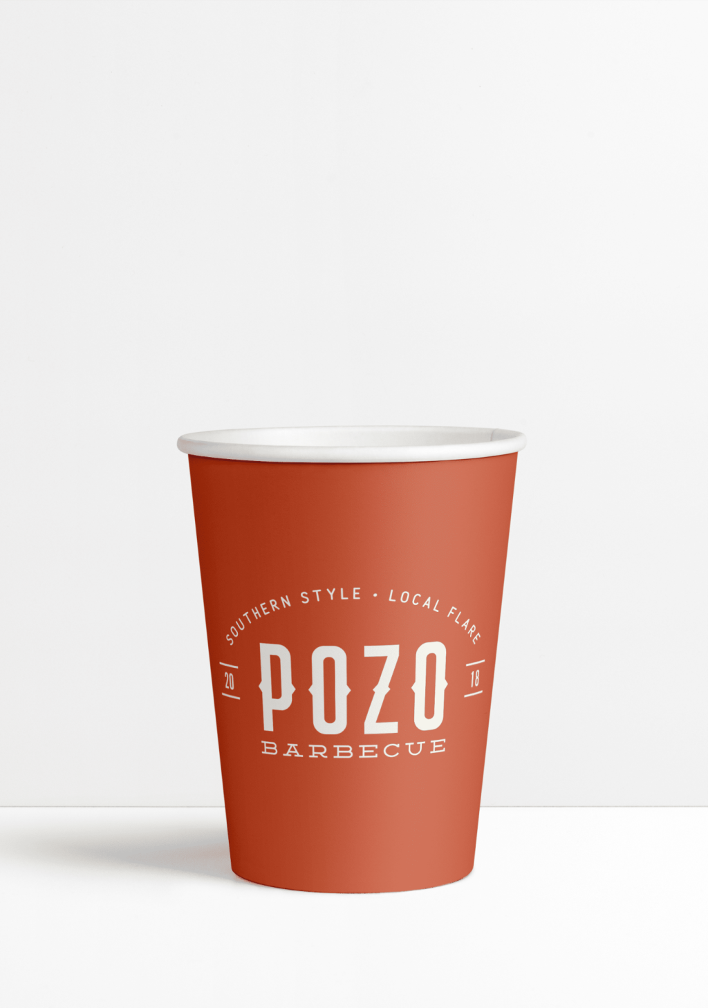
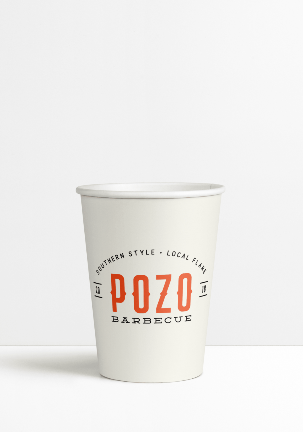
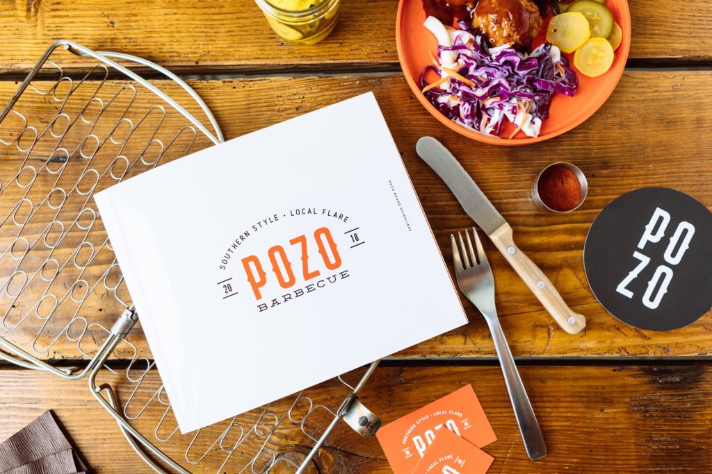
The typog­ra­phy selec­tion echoes the con­trast between tra­di­tion and moder­ni­ty. The Stock­port Extra type­face used for POZO” car­ries the robust, stur­dy char­ac­ter of tra­di­tion­al bar­be­cue sig­nage, while main­tain­ing clean lines that speak to con­tem­po­rary design sen­si­bil­i­ties. Like per­fect­ly ren­dered fat on a brisket, the let­ter­forms bal­ance sub­stance with refinement.

The sup­port­ing type­faces — Dem­ing EP for BAR­BE­CUE,” Free­day Sans for the tagline, and Alter­nate Goth­ic No.1 D for the estab­lished date — cre­ate a typo­graph­ic land­scape as var­ied and com­ple­men­tary as the fla­vors in a well-craft­ed sauce.

Chromatic Palette: The Colors of Heat and Hospitality

The brand’s col­or sto­ry unfolds through three prin­ci­pal hues that work in con­cert to evoke both emo­tion­al and sen­so­ry responses:

  • Black: Deep and res­olute as the night sky over desert sands, ground­ing the visu­al iden­ti­ty with authority
  • Sun­rise Amber: The dis­tinc­tive orange-red that cap­tures both the glow of hot coals and the vibrant ener­gy of cul­tur­al fusion
  • Sand­stone: A warm cream tone rem­i­nis­cent of Qatar’s nat­ur­al land­scape and the invit­ing com­fort of South­ern hospitality

This palette evokes both the ter­roir of Qatar and the her­itage of South­ern bar­be­cue — a visu­al rep­re­sen­ta­tion of the restau­ran­t’s cross-cul­tur­al DNA.

pozo brand book Image loaded

Cultural Infusion: A Global-Local Dialogue

What makes Pozo tru­ly remark­able is its abil­i­ty to func­tion as a cul­tur­al trans­la­tor. Through thought­ful design choic­es, the brand speaks simul­ta­ne­ous­ly to the expat com­mu­ni­ty’s nos­tal­gia for home and to locals’ curios­i­ty about glob­al culi­nary traditions.

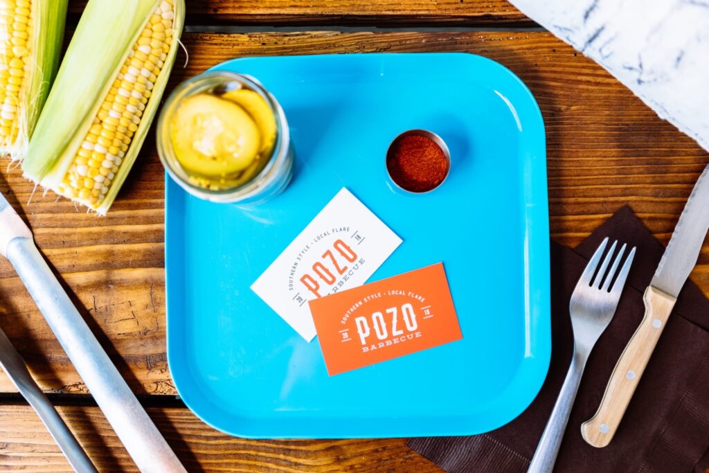
The tagline South­ern Style • Local Flare” encap­su­lates this dual­i­ty with ele­gant econ­o­my of lan­guage. The inten­tion­al spelling of flare” (rather than flair”) cre­ates a dou­ble mean­ing that ref­er­ences both flames and dis­tinc­tive char­ac­ter — a lin­guis­tic expres­sion of the brand’s essence.

The Future Feast

Pozo rep­re­sents more than just a din­ing des­ti­na­tion; it embod­ies the art of cul­tur­al con­ver­sa­tion through cui­sine. Like the slow-cooked per­fec­tion of bar­be­cue itself, the brand was devel­oped with patience and respect for tra­di­tion, while embrac­ing the oppor­tu­ni­ty for innovation.

In a world increas­ing­ly defined by cul­tur­al exchange, Pozo stands as a tes­ta­ment to the pow­er of design to cre­ate authen­tic con­nec­tions. Here, in the meet­ing of smoke and spice, tra­di­tion and inno­va­tion, East and West, Pozo cre­ates not just a meal, but a moment of gen­uine cul­tur­al communion.

Pozo-brand-book-name Image loaded

You Have a Sto­ry Worth Telling

Contact Needmore