When I was growing up, my favorite medium for art was the music album. And while the LP Record was the "fine art" of the category, the humble cassette tape was too convenient to ignore. For most of the Eighties, that's how I bought my music.
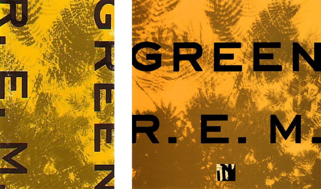
But this format was frustrating to someone who cared about the artwork and design. The usable space went from 144 square inches to a mere 10, and the aspect ratio changed completely. It was inevitable that the layout would have to change, too.
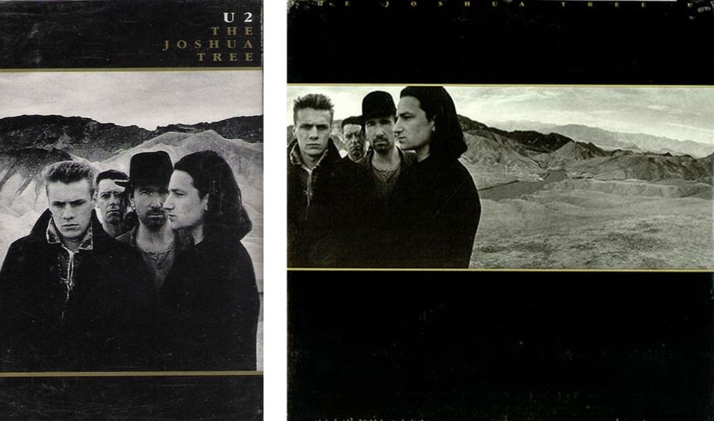
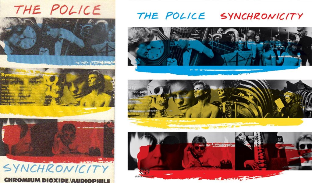
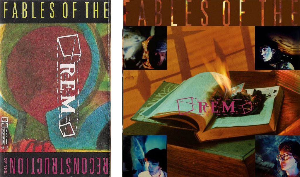
The design didn't change in the same way for all albums. Pretty much anything released before the late Seventies was probably set in stone, leaving little option but to show the record art in a 2.5 inch square. This was non-optimal, and plagued my collection.
For albums released contemporaneously, however, it was a different story. The creators were aware of the need to also release a cassette, and therefore considered this in their design.
This led to cassettes that had unique features of their own. Bits of design might be assembled differently for each format, or in the case of some like The Joshua Tree, different photography might be used, better conforming to that aspect ratio.
In some ways, this felt like an early form of what we might now call responsive design. Over time, designers adapted to the new formats, and came up with a process that took that into account. They had less control over things like the aspect ratio, and that forced them to work harder and more flexibly.
If I'm being honest, though, I'm glad the cassette is (mostly) dead. They looked and sounded terrible. But having an always-online computer in my pocket remains pretty damn useful.
From early adopter to keynote speaker to Pro Partner—our journey with WooCommerce spans the platform's entire history. After 14 years of crafting e-commerce experiences for coffee roasters, specialty food brands, and mission-driven companies, we've achieved WooCommerce's highest recognition. Here's how we got here and where we're headed next.
Rebuilding our 15-year-old coffee tasting app revealed how dramatically home brewing culture had evolved while we were designing for coffee businesses, teaching us valuable lessons in the process.