
A Tack Sharp Redesign for Hammer & Hand
By Kandace Brigleb
in Our Work
A modernized portfolio for timeless builders
For twenty years, Hammer & Hand has thoughtfully crafted iconic, über-efficient homes and renovations, guided by an ethic of quality, durability and beauty. In redesigning their website, we had a dual focus of giving the website a facelift and to rearchitect the visitor experience.
Founded in Portland and recently extending to Seattle, Hammer & Hand has emerged as a thought-leader in their field not only for groundbreaking projects, such as the ambitious Passive House, but also by generously sharing the meticulous details of their findings and process.

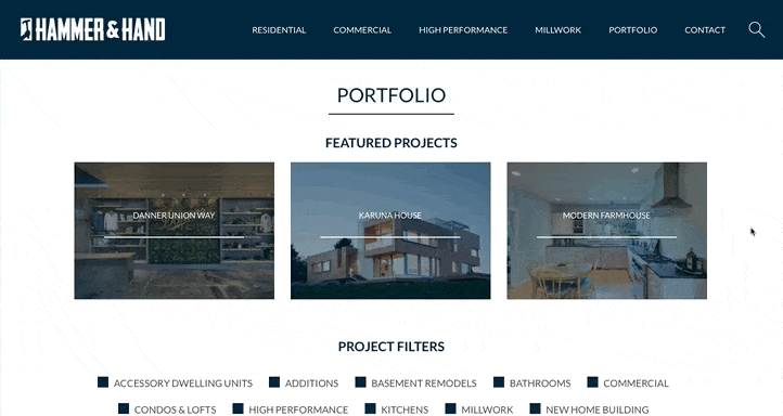
This was far beyond a visual refresh; we engaged in a comprehensive structural overhaul. Pouring over hundreds of web pages and a three-level-deep menu system, we stripped the site back to the basics and let the photography take front and center.

While their logo was to remain intact, we had the flexibility to explore mood and colors. We introduced a updated visual language (fonts, colors, icons) that considers Hammer & Hand's phenomenal work and wealth of resources a focal point.
Hammer & Hand works seamlessly with both modern and traditional designs. As such, their website needed to visually support portfolio pieces in a variety of styles, much as we would with an artist's portfolio.
Our challenge was to harness the wealth of information they had amassed over the years and transport it to a modernized system that would not only put Hammer & Hand in the driver's seat, but also compliment their wide-ranging talents and portfolio.

As noted, Hammer & Hand is generous with sharing their vast storehouse of knowledge. So, we made sure that crucial landing pages are interconnected to videos, blog posts, and similar projects. This is a website built to serve this bustling studio for years to come.
Even a month after launch, the redesign produced staggering results. Bounce rates improved immensely; the ever popular home page bounces rates are down nearly ten percent. The most incredible return has been on service pages where, for example, Basements are seeing an over 67% drop in bounces. This means more people on the site and more readers engaging.


