Subscription Site Design Strategies
By Kandace Brigleb
in In the Press
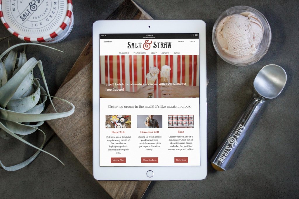
The folks at WooCommerce have written a must-read article on subscription website home page strategy and design. In it, they make a compelling case for how important it is to create a clear, engaging page for a stellar first impression. We're thrilled to see our work for Salt & Straw and Supercrown Coffee Roasters among the examples (both created with WooCommerce's subscription plug-in).
Supercrown Coffee Roasters
Supercrown is a coffee subscription curated by Roaster Darleen Scherer. The model is crystal clear: subscribe and join Darleen's expiration through coffee. The sign-up experience is equally transparent.
"Supercrown Coffee Roasters also has an amazing tool on their homepage used to show you the exact price you’ll pay when you select the coffee volume and delivery frequency you prefer. This transparency goes a long way to keeping potential customers satisfied… and on your site."
Salt & Straw
From Salt & Straw, we learn that crystal clear benefits and gorgeous photography go a long way.
"The appeal of an ice cream subscription is likely obvious, but Salt & Straw clearly explains why their ice cream subscription is the one worth buying: with their Pints Club, you get five new flavors to try each month. It’s a crystal clear sales pitch that sets them apart. Note also that Salt & Straw uses a combination of images and text to make their point clear. You’ll see the same theme repeated with many of the other sites highlighted here. You can say whatever you like about your products or the benefits of a subscription model, but great photos are ultimately one of the best ways to drive your point home."
These are a couple of the handful of tips for customizing a subscription website's home page. Check out the full article for more.
