 Image loaded
Image failed to load
Image loaded
Image failed to load
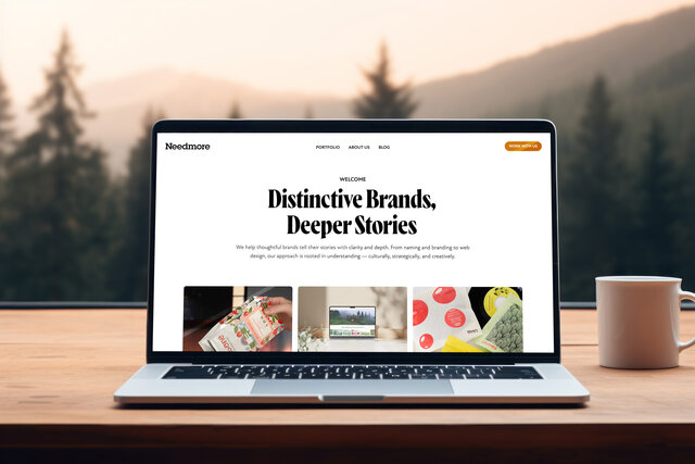
The Stumptown Redesign, Part Two
By Raymond Brigleb
in Our Work
The first thing we wanted to try was something very similar to the old, Flash-based site. This is very much along those lines.
We started thinking about how we would tackle other pages, and realized that the category list for coffees would be very important.
However, we didn’t really like the way this looked. We moved on to a mockup of a single coffee category, but wanted to do something that would better represent Stumptown’s emphasis on personality, color, and photography. They have a new line of bags for their coffee, which feature coffee cards that look much like baseball cards. What if we incorporated that look?
That’s more like it. You could then navigate between coffee regions (Africa, Latin America, and so on), see a nice big image and description of the region, and more.
I personally felt the colors were looking a bit too dark, so I wanted to try something lighter. Here we see our improved idea for showing the coffee regions - represent them as cards, with pictures, which look like the coffee cards folks will see in the stores.
Now we were ready to revisit our idea for the home page. This time, we wanted to just show a video. The idea was that you were jumping right into the Stumptown experience, and the little arrows on each side would let you switch between the videos.
We were really on to something, and at this point we stopped and went over our ideas with the client. And tomorrow, we’ll talk about our next round!
You may also enjoy...

The Patagonia Principle: Building Websites That Last a Decade (or More)
Ten years ago, we promised clients websites that would last a decade. Here's how we delivered on that promise, and the valuable lessons we learned about digital sustainability along the way.
By Raymond Brigleb
Moving Our Website to Craft CMS
After two decades on WordPress, we rebuilt our website from scratch with Craft CMS. The result? Lightning-fast pages, perfect Google scores, streamlined content management, and the joy of storytelling.
By Raymond Brigleb
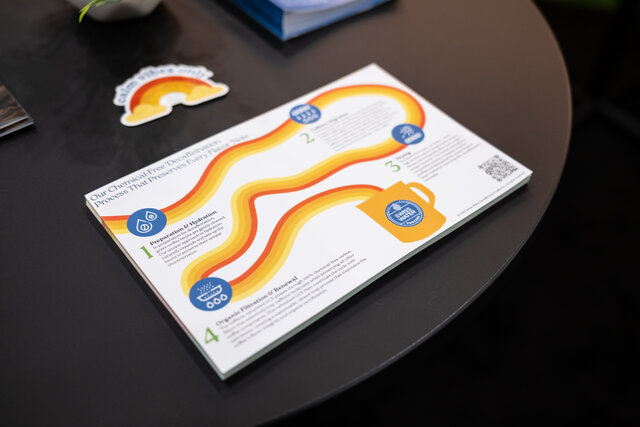
A Fresh Look for Swiss Water® Process at SCA Expo Houston
Needmore Designs unveils a vibrant, refreshed brand identity for Swiss Water® at the SCA Expo Houston, showcasing bold booth design and playful storytelling.
By Kandace Brigleb