Tom’s of Maine is one of those companies you almost don’t notice. They’re just there in the background. When you brush your teeth. When you wash out your mouth. I’m not sure how long I have been aware of them, but I didn’t think they had been around for all that long.
Turns out, they’ve been around since 1970, when they were started by a couple with five thousand dollars.
One of the few things I did know about them, however, is that they had been bought out by a big health care company. And that did confuse my image of them just a little bit. Turns out that rumor was true.
In 2006, a controlling 84% stake in Tom’s of Maine was purchased by Colgate-Palmolive for US $100M. The Chappells kept a 16% share in the company. The terms of the purchase stipulate that Tom’s of Maine’s policies will be retained.
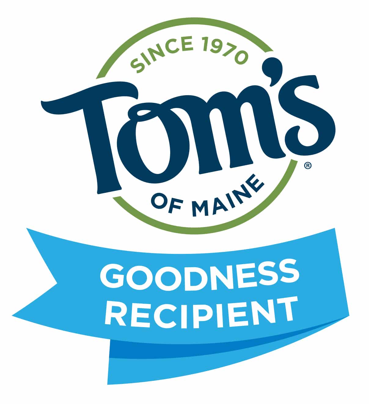
Well that’s good, it sounds like the story has some kind of a happy ending. And in another sign of their changing times, they appear to have redesigned their identity late this year. Here is a before and after.

It’s interesting, and I do myself prefer it, but I think it fell slightly short of the mark.
For one thing, we found that the two colors seemed… odd. Why is “of Maine” blue, but the rest of the extra design green? Probably because the name of the company is “Tom’s of Maine,” but using the two colors almost seems like an afterthought.
Also, the “Since 1970” is an interesting addition, and in fact it’s what prompted us to write about this. Yet the big win with the old logo is that it didn’t need to say it was 40 years old. It was obvious in the design!
Between us, we suspect there was a lot of internal debate about this logo. I would be very curious to find out who designed it (VML?) and what the process was behind it.