 Image loaded
Image failed to load
Image loaded
Image failed to load
Unpacking Coffee Brand Refresh
By Needmore Designs
in Studio Notes
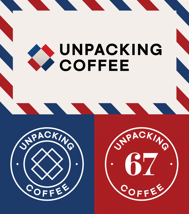 Image loaded
Image failed to load
Image loaded
Image failed to load
Cosmic Cosmica
As we head into Season 4 of our coffee podcast, we began itching for an identity that would be reflective of the show's evolution. Truth be told, we are always dreaming about typography. Years ago, we focused on a pleasant pairing of typefaces that would work for our internal projects. Specifically, we selected the combination of Galaxie Polaris and Galaxie Copernicus from the Constellation type foundry (designed by Chester Jenkins). Over time, however, we found ourselves appreciating Polaris less and less. We're fickle like that. The weights didn’t quite work for us and we are drawn designs that are a bit more geometric. We couldn’t help but notice that we’d been using fonts like Futura and Avant Garde whenever we got a chance, eschewing Polaris. It felt like time to revisit our design decisions.
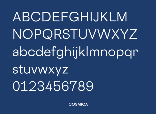 Image loaded
Image failed to load
Image loaded
Image failed to load
That’s when we discovered Cosmica. Conceptually, Cosmica fits into the same Galaxie design skeleton, but it happens to be a geometric sans. A geometric sans! Just what we were looking for—a typeface that fits in with Copernicus but has a more geometric character. And boy, it does have character. We were so enthralled with Cosmica that we took the opportunity to redesign much of Unpacking Coffee designs to match, with more to come.
Vintage Advantage
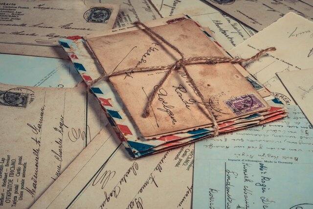
As we began the redesign, we took a moment to remember the basis for the original designs. The show is based on the experience of ordering coffee and discovering it as it is delivered. It is also about the individual stories that crop up as coffee makes its way to us.
Image loaded
Image failed to load
This drew us to incorporate vintage envelopes and stamps which in turn encouraged us to revaluate colors as well as typography, creating a modern brand with a nod to the fact that coffee is a traveler.
Incorporating a New Look
We unveiled our new brand in time for the release of the first episode Season 4, focusing on Chicago's Metric Coffee. https://vimeo.com/337912068 At the same time, we are hard at work revamping our social media presence for Unpacking Coffee. Follow along as the new identity shows up in our Instagram and Twitter presence.
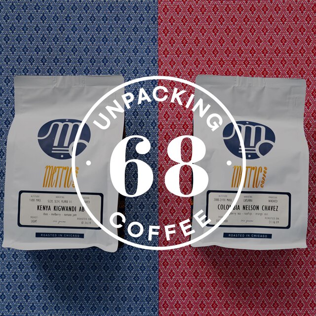 Image loaded
Image failed to load
Image loaded
Image failed to load